Rollin' n Bowlin'
Rollin’ n Bowlin’ started as a health-conscious concept that provides fresh and affordable meals – bowls and smoothies – for TCU students to enjoy. This concept has grown into a successful business and cafes are opening up in different universities across the country. Recently, Rollin' n Bowlin' decided to rebrand and expanded towards retail.
Objectives
• Packaging Design
• User Testing
• Brand Identity System
• Illustration & Iconography
• Environmental Design
• Collateral Material
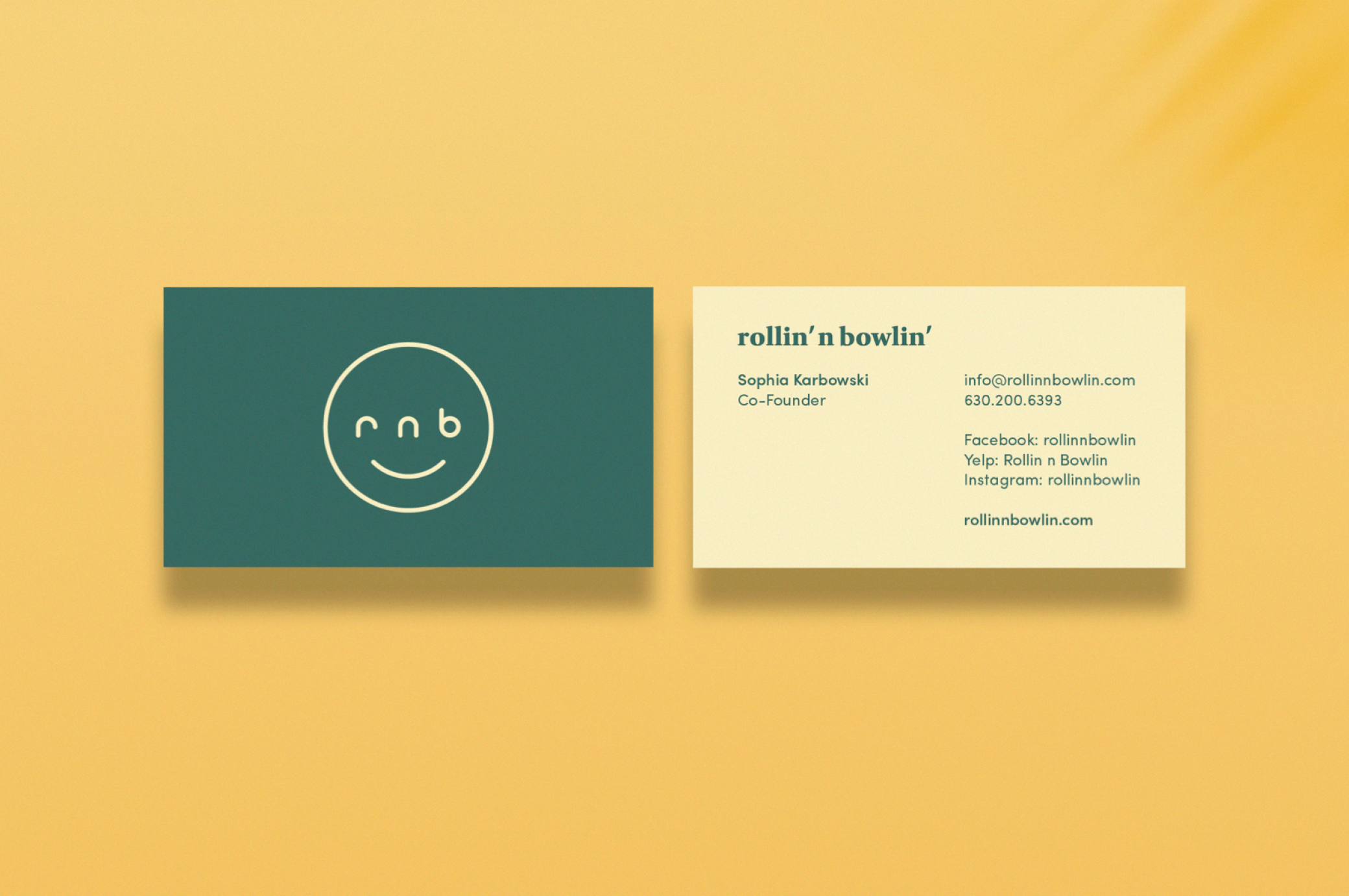
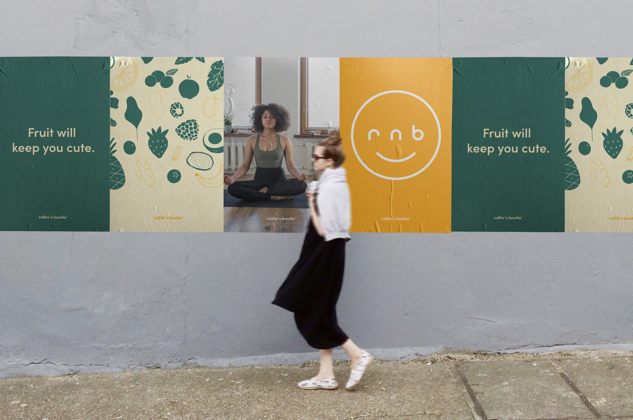
Brand Identity System
The Objective
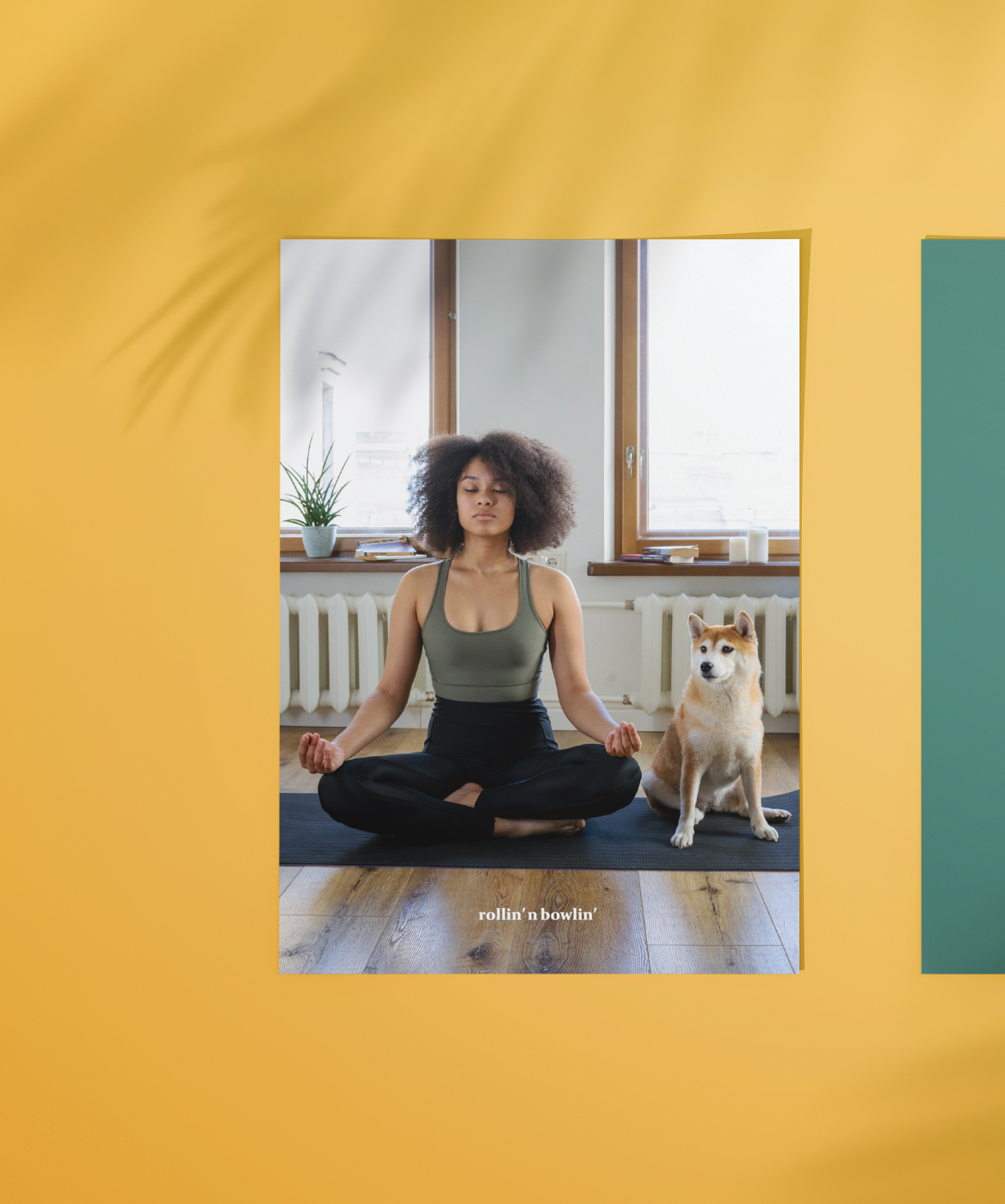
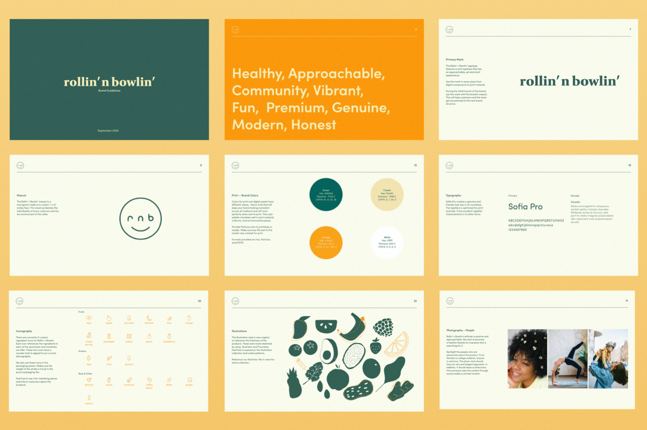
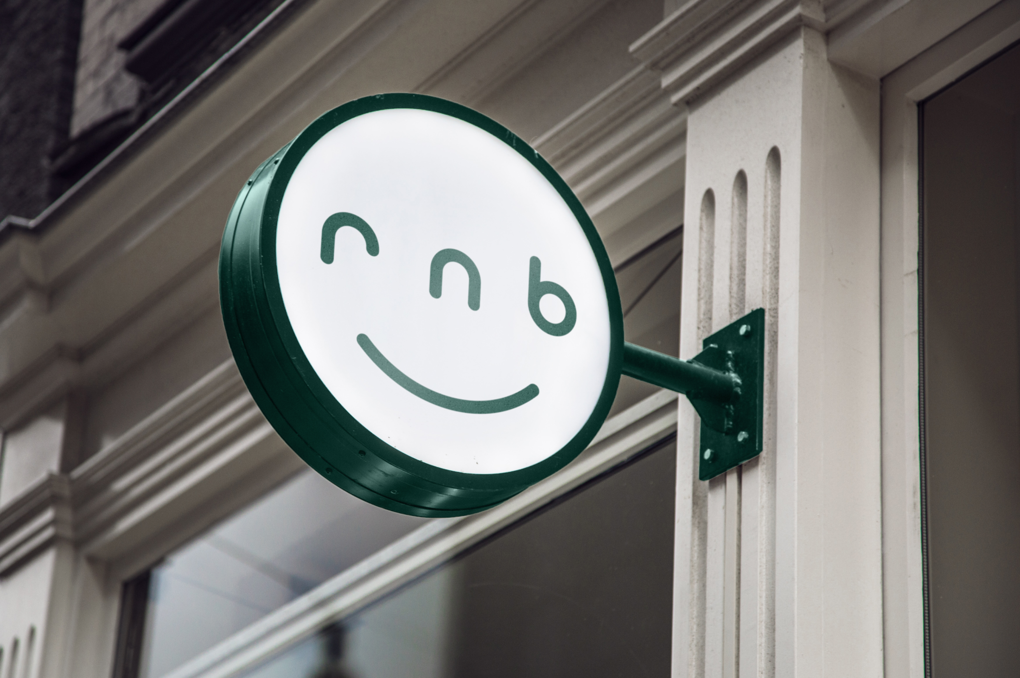
Rollin’ n Bowlin’ had gone through numerous rebrands since they were founded back in 2016. They lacked a sense of clarity in their mark and needed a design system that would be translated well in print and digital components. In addition, the team wanted a mark that would portray their authentic, approachable, and fun vibe.
The Approach
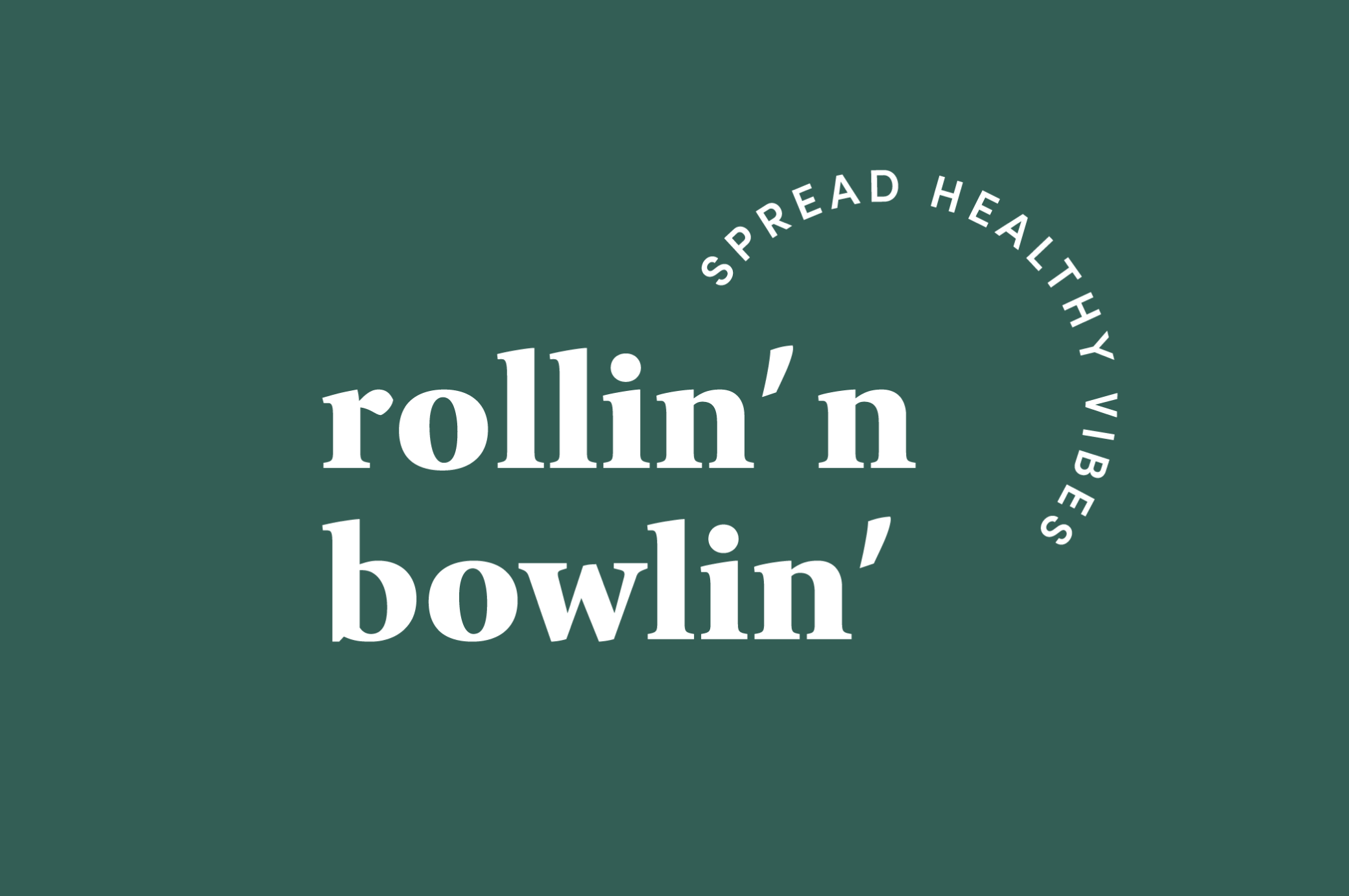
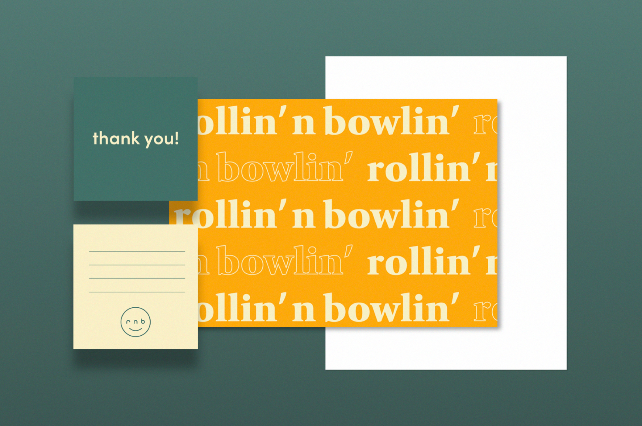
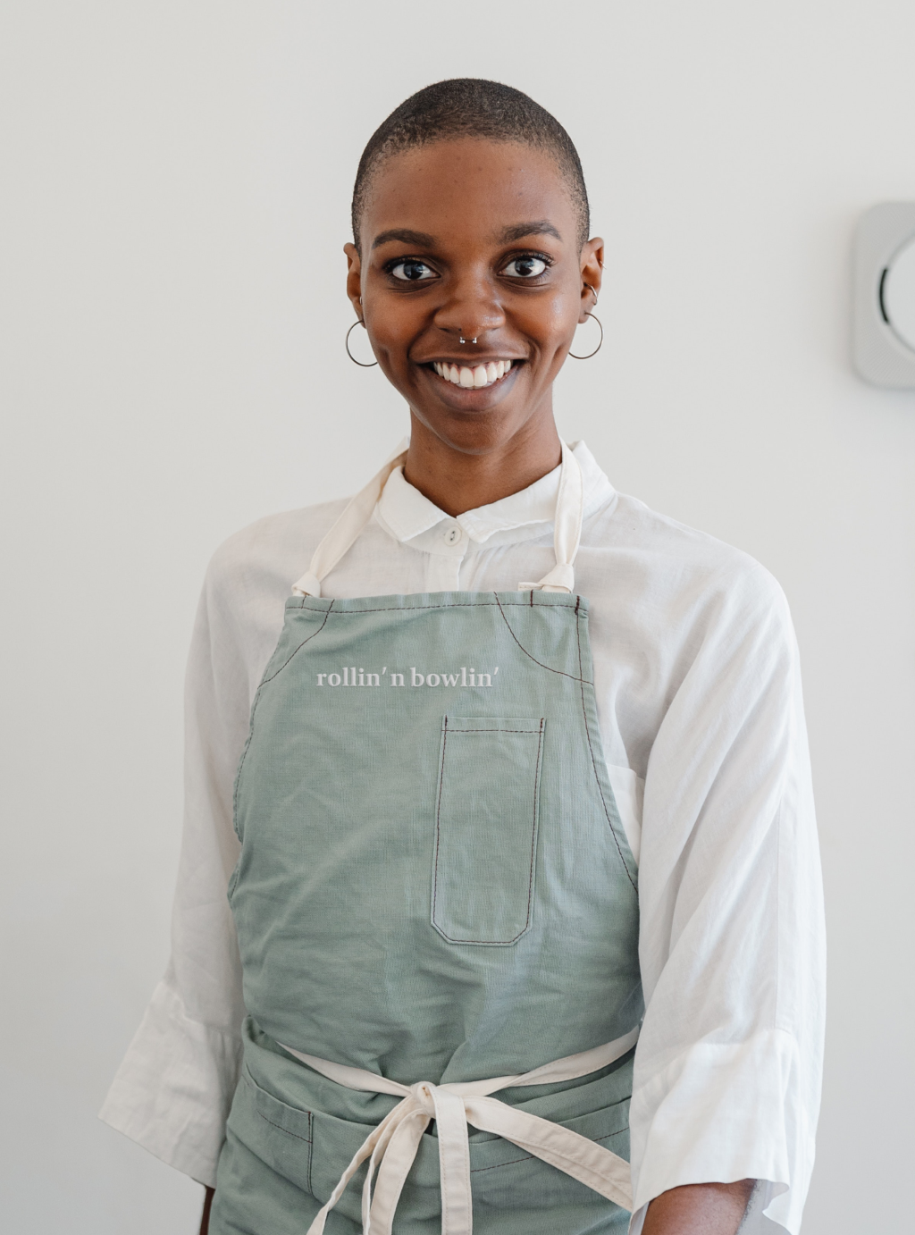
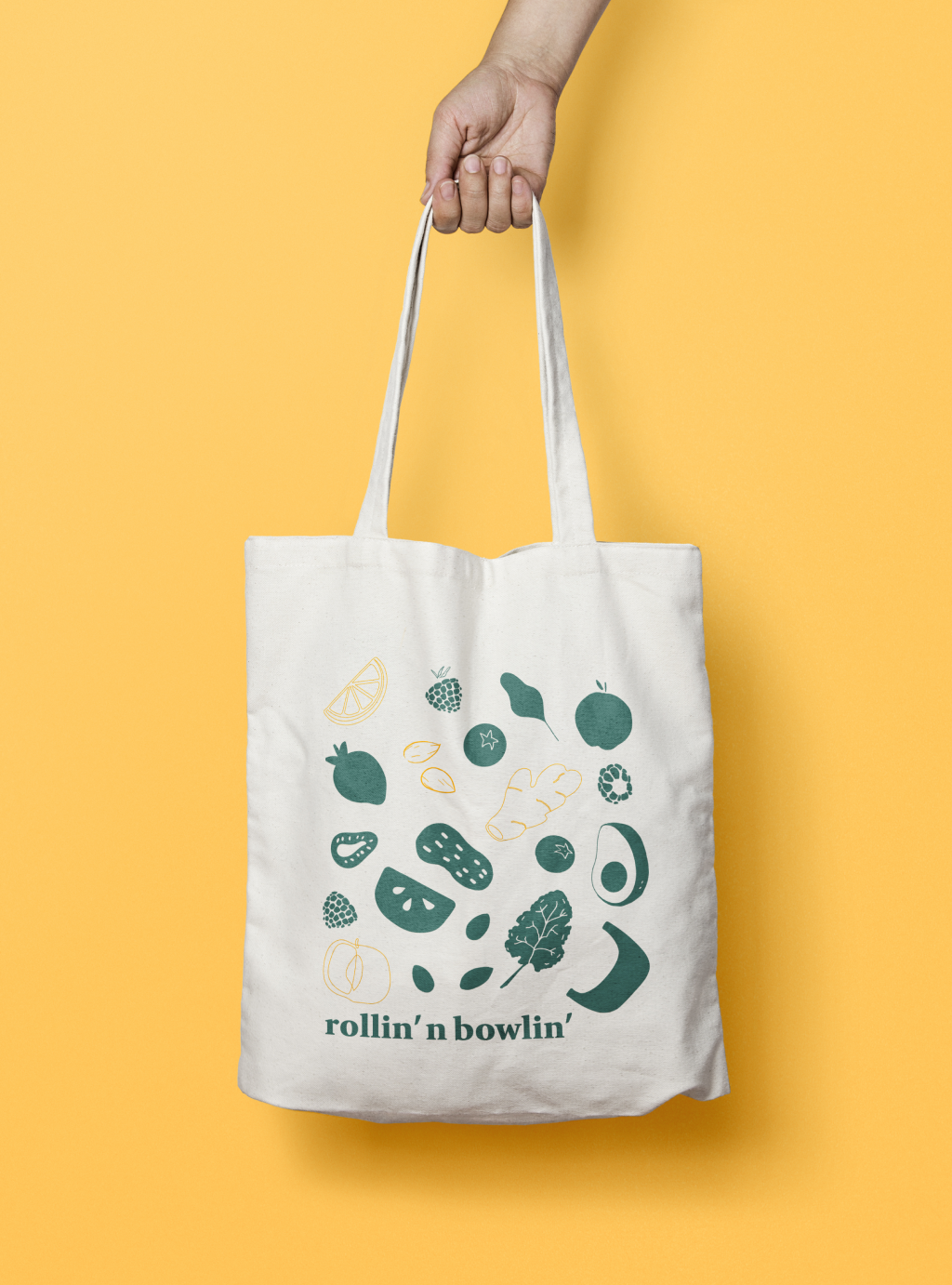
I created a mark that’s centered in Rollin’ n Bowlin’s whimsical personality. The mascot is a monogram containing “rnb” within its smile. The rest of the system evokes a genuine and honest approach. The brand is made up of custom iconography, hand-sketched illustrations, vibrant colors, friendly typography, and airy photography.
All of these components were translated into all of their brand components including their cafes, packaging design, social media, marketing assets, and website.
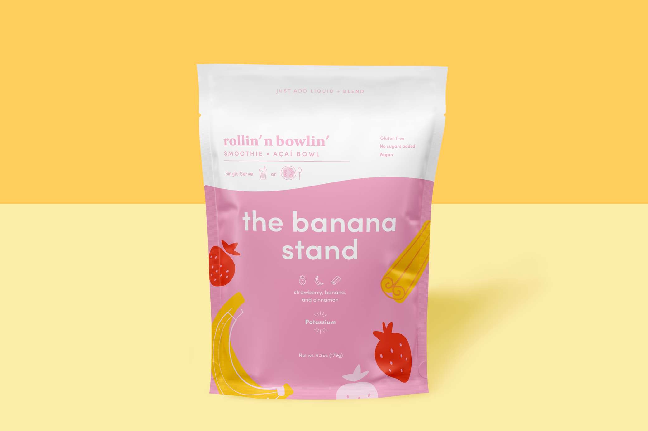
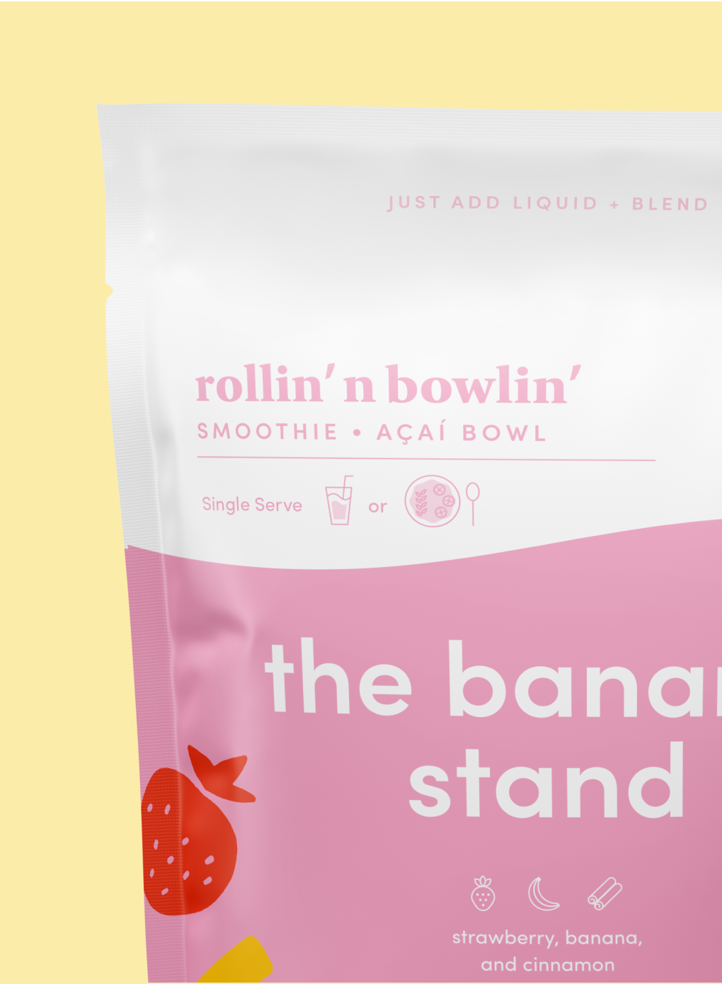
Packaging System
The Objective
In the past few years, Rollin’ n Bowlin’ has seen success through their cafe-models in universities. Their goal was to translate their fun essence and healthy meals into a packaged product. This will allow a larger pool of customers to purchase a smoothie/bowl flavor and enjoy this product at home.
Another goal for their team was to target a new demographic in the market. Therefore this package design needed to appeal to a few specific groups.
The Approach
We did a discovery session to better understand the brand’s expansion. From there I synthesized information, created personas, and a creative brief. These tools were later used to help us create mood boards and concepts.
I created a vibrant packaging design system with clear iconography, messaging, and organic illustrations to emphasize the 9 different flavors.
We were able to do user testing to best identify what loyal customers of the brand were resonating towards and to validate design decisions.